This week’s question comes from Julie, who asks:
I definitely judge a book by its cover. I mostly buy my books from the used market. More often from thrift stores than from actual book stores. Paperbacks generally run for 50 cents and are arranged in chaos. What are the factors in buying a book for 50 cents? Recognizable authors, catchy titles, and if when you pull the book out it catches your eye, well it is probably coming home with you.While acknowledging that we can’t judge books by their covers, how much does the design of a book affect your reading enjoyment? Hardcover vs. softcover? Trade paperback vs. mass market paperback? Font? Illustrations? Etc.?
Does cover eat make me enjoy the story more? Generally not. If a book cover is plain or even garish it doesn't detract from the words on the page once I am reading it (though it may detract from me picking it up in the first place.) But there is absolutely nothing I hate more than reading a story and flipping to the cover to discover that the picture does not reflect the story accurately. I rarely see a character's physicality in my mind and often look to the cover for clues. I am sure you can imagine how infuriating it is to turn there and know that they didn't get it right.
Someone, somewhere, recently asked monetary issues aside what is your favorite type of binding. I have always preferred trade paperback books. I like how the wider expanse feels in my hands. Sometimes when I am reading a mass market paperback I feel it cramping in my wrists. Even though we aren't supposed to consider money now, I think money has always been a main factor in my preference of softcovers. Why buy one book when you can buy four? I have recently discovered that I prefer hardcovers for traveling. But mostly I just generally enjoy books. I enjoy looking at them, touching them, flipping the pages.
Currently I am reading two books; one which the cover is helping me enjoy the book and one which isn't.
The cover for Atlas Shrugged
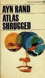
I try to figure out what the images on the cover mean and how they relate to what I have just read in the text. The image on the right hand side that looks like a map is particularly intriguing. My eye races over it watching the plot unroll across the shapes and lines.
In contrast, Artemis Fowl
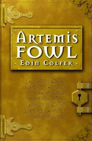
As far as purchase appeal, this is one I would definitely grab. (If you are intending to do the same Amazon has a great price on this book right now. Only $2.99!!!) But as far as reader enjoyability, this cover adds NOTHING to the experience of reading the book. There is no shutting the book and musing over the future of the characters and what events will lead them there. Not induced by the cover at least!
Do you have a response to either of these covers? Share it with me!
I also dislike it when the cover doesn't match the story - I keep thinking why? But it doesn't spoil my reading enjoyment - that depends on the content of the book.
ReplyDeleteI do like the look of the Artemis Fowl cover - you see I am influenced by the cover - I would pick it up to look at it, but I'd only read it if the content appealed to me.
Once I get into the book, I forget the cover. There's usually no rhyme or reason to how thrift stores stack books. I was just in one today.
ReplyDeleteI have a real issue with covers that don't match the book, because the place where I meet that most often is in books for children. I suspect that what has happened is that an artist has created a cover based on a synopsis rather than having actually read the book. It's part of the anything goes if it's for children syndrome that you find in some parts of the industry and the lack of respect for the readers of tomorrow really annoys me.
ReplyDeleteI prefer covers without people on them... or at least without their heads, because they almost never look like the picture I have in my head. I prefer to imagine.
ReplyDeleteThanks for visiting!
Great post. I also buy most of my books through used book stores and thrift shops and the cover, title and author are often the only things to go on in that chaos.
ReplyDeleteMe, too - I just enjoy everything about books - reading, handling, just looking through them. Guess that's why I haven't gone over to electronic books yet.
ReplyDeleteAlso, I've always loved the cover on that edition of Atlas Shrugged. But I've never been able to make myself read the book!
I thought that cover of Artemis Fowl looked really alluring, too. But then I got into the text and was bored silly. O well!
ReplyDeleteI look at cover art to get an idea of what people/places in the story should look like too. It IS annoying when they get it wrong!
ReplyDeleteI'd probably pass the Ayn Rand book by based on that cover, but then I'd do the same to certain editions of my favourites...
table talk - young adult and children's books were exactly what I had in mind when I made the comment about the covers not matching. It is so infuriating.
ReplyDeletemarianne - you are a better woman than I, no imagination here
jlshall - you HAVE to read Atlas Shrugged. I thought I would have to struggle through it, but have found it to be a page turner.
jeane - my best friend suggested I read Artemis Fowl 6 years ago. I went out and bought it, started reading it, put it in my purse and forgot about it. For the next 5 years it was sitting in that purse and I just found it last week. I have to admit I am struggling through it.
Jennifer - I definitely didn't pick up Atlas Shrugged because it had a great cover, but now that I am reading it I LOVE the cover.
The Atlas Shrugged title doesn't make me want to read the book at all. It's a very boring cover. The cover of Artemis Fowl, on the other hand, is very intriguing to me, even though it might be a little bland.
ReplyDeleteI should start going to thrift book stores but it seems so much harder to find a good book there. I also agree with you about the cover - when the art doesn't match the cover, it annoys me. Especially if it looks like a scene from the book because then I keep trying to find what scene the artist may have been trying to protray.
ReplyDelete